How to be your own publisher
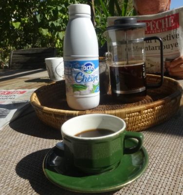
Ruth in need of coffee at a board meeting with John!
I don’t know what I’m doing! I’m learning on the job and wondering if what I do is make mistakes and then recover from them. The learning curve I’m riding gets steeper and deeper and the pressure to do it all at once keeps on mounting. Yesterday I was sent a cover design and a typeset sample of my next book. They are linked, of course. The font on the cover is used for the chapter headings inside. This is critical. Do I really like it? My designer, Spiffing Covers, tells me that he wants to brand all my books in a similar way. What does this mean? What do you – my readers- think of this idea?
Branding Ruth Hartley
 What is being branded? Is it me the writer or Ruth Hartley’s books, or both? When I sold art in Zambia I discovered that art patrons often felt they had bought a large chunk of the artist too. Do readers feel this way about writers? I’m always curious about the writers I read but then I know that writers write about what matters most to them. It’s true that any really good book can stand on its own but in the present world of social media mash-up everything gets whizzed into the mix. If it’s me, I hope I don’t come out as gloop! Well – if you want to know who I am – see if my books can tell you that! Once you become famous your readers want to know what you eat and what films you like plus more intimate details – then you get trolled too!
Fame is not fun! Put that on your bathroom mirror! Not something that worries me yet!
That indefinable, ridiculous, categorisation – “genre”
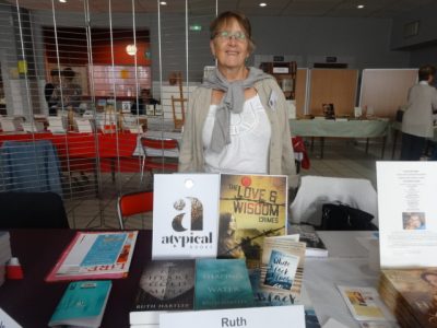
Ruth at the Salon du Livre in Vic en Bigorre among the writers in English
The writers I love can’t be categorised. They are writers like Angela Carter, Ursula Le Guin, Doris Lessing, Salman Rushdie and Jeannette Winterson who write literature and refuse genre labelling. They are, of course, so well-known that all their books need to do to sell is to sit on a book shelf under the writer’s name. Unknown writers like me have to be put into a genre to be marketed and we have to make that genre obvious on our book covers.
This is my new imprint – ATypicalBooks.com
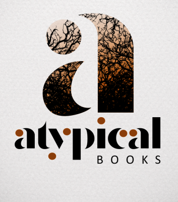
The logo of Ruth’s new imprint
What do you think of it? I will be publishing my books under this logo in future. I think the logo hints at what it means but in the end what matters, is what you think it means so your comments will be appreciated. Please do tell me what you think. Does it reflect the writer I am and give you an idea about the genre I write
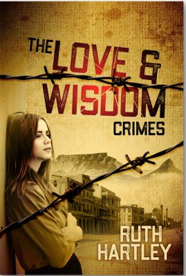
The Love and Wisdom Crimes
Here, too, is the cover of my new book, The Love and Wisdom Crimes which will be out before the end of the year and which will be published at the same time as the poems from The Spiral Bound Notebooks that inspired it.
Book covers are important as Emma Darwin writes in her blog.
3 Comments on “How to make a book look good enough to read”
I love the imprint design for atypical books!
The cover of The Love and Wisdom Crimes is also intriguing. I like all the elements and the composition… but with the dark text on brown background, I don’t know what the spine would look like; it might not stand out on a bookshelf. Do they show you the spine as well?
Hi Tia – yes you have a point – I havee yet to check the design for the spine!
Thanks Tia, I look forward to seeing yo and spending more time assessing the cover for my next book!